
This post is in continuation with my NLP blog series. You might want to checkout my previous blog in which I discussed data pre-processing in R. In this blog, I will determine the emotions in Ted Talks. At the end, I will compute a HeatMap of emotions and talks to aid in our visualization.
So, without further ado, let’s dive in!
As I have already discussed detailed data pre-processing steps in my last blog post, I will assume that you have already prepared a Document Term Matrix.
exploring the dataset
We will begin by importing General Inquirer Category Listings Dataset. The dataset sources word categories from 4 different dictionaries. A particular category houses several words pertaining to the semantic meaning for that category. For example – The “Pleasur” category has words indicating the enjoyment of a feeling, including words indicating confidence, interest and commitment.
|
require(“tm.lexicon.GeneralInquirer”) |
For determining emotions in Ted Talks, choosing categories is an open-ended task. I picked up categories which I felt would best suit the emotions in this talks. Later, as we’ll see, the heatmap would validate my choices. You can pick up completely different categories for your practice and it would still be fine.
Computing term score
Next, we are going to compute a score which will signify how many terms in the DTM match with the words present in the categories imported in the step above. We use tm_term_score function for this purpose.
| emo_score <- tm_term_score(dtm, words_with_emotions) pleasure_score <- tm_term_score(dtm, words_with_pleasur) pain_score <- tm_term_score(dtm, words_with_pain) virtue_score <- tm_term_score(dtm, words_with_virtue) vice_score <- tm_term_score(dtm, words_with_vice) |
category wise scoring the document
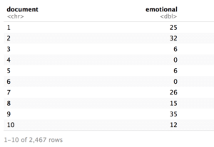
After computing the score, I am going to prepare a dataframe containing the category score for each document.
| library(dplyr) library(tibble) library(tidyr) library(tidytext) library(gplots)doc_emo_df <- tbl_df(emo_score) %>% rownames_to_column %>% rename(document = rowname) %>% rename(emotional = value) doc_pleasure_df <- tbl_df(pleasure_score) %>% rownames_to_column %>% rename(document = rowname) %>% rename(pleasure = value) doc_pain_df <- tbl_df(pain_score) %>% rownames_to_column %>% rename(document = rowname) %>% rename(pain = value) doc_virtue_df <- tbl_df(virtue_score) %>% rownames_to_column %>% rename(document = rowname) %>% rename(virtue = value) doc_vice_df <- tbl_df(vice_score) %>% rownames_to_column %>% rename(document = rowname) %>% rename(vice = value) |
One such dataframe looks like:
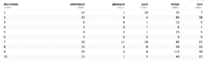
Subsequently, I join all the dataframes together by their document number. This results in a single dataframe containing the scores of each category for each document.
| library(tidyverse) all_emotions <- list(doc_emo_df, doc_pleasure_df, doc_pain_df, doc_virtue_df, doc_vice_df) %>% reduce(inner_join, by = “document”) |
This step results in the dataframe that looks like this:
VISUALIZATION VIA HEATMAP
The next step is to make a heatmap for visualization. I use heatmap.2 function in which we need to feed a numeric matrix of the values to be plotted. Therefore, that’s the first step I undertake – converted the dataframe computed above in the matrix form. Subsequently, that matrix was fed into the heatmap.2 function, along with several other parameters. I have commented the description and usage of every parameter in the code below. I learnt the usage of heatmap from Sebastian Raschka’s blog.
| # transform the columns (except document number) into a matrix mat_data <- data.matrix(all_emotions[,2:ncol(all_emotions)]) rownames(mat_data) <- all_emotions[,1][[1]] # assign row names heatmap.2(mat_data, cellnote = mat_data, # same data set for cell labels main = “Emotions in Ted Talks”, # heat map title notecol=“black”, # change font color of cell labels to black density.info=“none”, # turns off density plot inside color legend trace=“none”, # turns off trace lines inside the heat map margins =c(12,9), # widens margins around plot col=colorRampPalette(c(“red”, “yellow”, “green”))(n = 299), # use on color palette defined earlier Colv=“NA”, # turn off column clustering dendrogram=‘none’) |
The code results in the heatmap below.
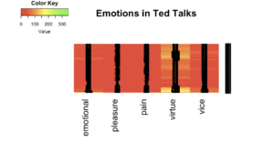
As you can see in the heatmap above, red color dominates throughout. A clear cut reasoning for that lies in the fact that the DTM is extremely sparse. With 99% sparsity in DTM, the words in the five categories (emotional, pleasure, pain, virtue and vice) could not match the majority of the terms present in our DTM. Small stretches of yellow lines denote the presence of particular emotions – virtue in this case. This means that speakers in their Ted Talks use a lot of words related to virtue in their speeches. The result could be different if you use different category of emotions.
That’s all for now. I will discuss a new task related to NLP in my next blog. So stay tuned.
Thanks for reading and I have written other posts related to software engineering and data science as well. You might want to check them out here. You can also subscribe to my blog to receive relevant blogs straight in your inbox and reach out to me here. I am also mentoring in the areas of Data Science, Career and Life in Singapore. You can book an appointment to talk to me.
One thought on “Emotions in Ted Talks: Text Analytics in R”